Users in the digital age These days users access websites from all manner of devices – smartphones, tablets, laptops, desktops and even smart TVs. If a website isn't responsive (designed to be viewed on all screen sizes) then this can lead to unhappy users, reduced engagement and conversions. This is where a Responsive Web Design (RWD) comes into play.
Responsive Web Design What it is and how it works Responsive web design (RWD) makes the website look good on all devices such as desktops, tablets, and phones. Responsive design is not a new trend but the status quo that isn't going away any time soon A full service digital marketing agency -Nivya Digital stands by the belief that responsive design isn't just about responding to your user's needs, but also about optimizing your SEO and being able to meet high conversion ratios with some changes.
In this complete guide, we’ll walk you through what responsive web design is, why it’s important, the benefits to implementing it alongside some best practices for creating a responsive website that your business can be proud of.
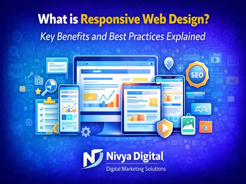
What is Responsive Web Design?
What is Responsive Web Design RWD (Responsive web design) is the practice of creating web sites and applications to function optimally on large monitors as well as SmartPhones & Tablets.
Instead of designing multiple, separate websites for both mobile and desktop use, responsive design utilizes:
● Flexible layouts
● Fluid grids
● Responsive images
● CSS media queries
This means that a single site delivers optimized content to all it serves irrespective of device.
We are a responsive web design company and all our websites we create or optimize include this feature.
Why Responsive Web Design Is Important Today
The way people have used the internet is totally different now. Mobile users are now the majority of internet traffic worldwide.
Key reasons responsive web design is essential:
● Most of the users surf with their smartphones
● Google uses mobile-first indexing
● Bad mobile experience lead to higher bounce rates.
● Responsive sites convert better
● Dealing with one website is simpler than dealing with multiple versions
The cost of not having responsive design is that businesses will lose traffic, rankings and customers.
How Responsive Web Design Works
What Is Responsive Web Design?Responsive web design is the approach of designing and developing a website so that it can be optimally viewed on a variety of devices or screen sizes.
Core components of responsive design:
● Fluid grids: Layouts use percentages instead of fixed widths
● Flexible images: Images resize within their containers
●Media queries: CSS rules apply based on screen size, orientation, and resolution
This is a great mix that provides for a smooth performance on any device.
Major Advantages of Responsive Web Design
Responsive web design has benefits for both the user and business.
1. Improved User Experience
A mobile-friendly site is simple to view, read, and use on your smartphone or tablet. There is typically no need to zoom, scroll excessively or navigate with difficulty.
We specialize at Nivya Digital in developing responsive layouts that are user-friendly and intuitive to help keep visitors engaged.
2.Better SEO Performance
Responsive web design is the safe choice recommended by Google. Benefits include:
● Single URL for all devices
● Better crawlability
● Lower bounce rates
● Improved rankings
Google’s mobile-first indexing technology works best with responsive websites.
3.Higher Conversion Rates
Guides Seamless on Mobile: What This Leads To:utfc-Research.Additionalcontent Sugared in..toMatchSnapshot + perfected_scroll#section-eternal-almostA Seamless Mobile Experience Results In These:
● More form submissions
● Higher purchases
● Better lead generation
Having a responsive design is the key and is directly related to conversion optimization.
4.Cost-Effective Solution
It’s less expensive and simpler to responsibly maintain one website than it is to manage mobile and desktop versions separately.
They were indeed able to earn a little more from the deals and business who are working with Nivya Digital will save cost in long run as they planned for scalable & responsive design.
5.Faster Website Loading
For one, responsive sites are performance designed, so the site loads faster – which is particularly important for mobile use.
Fast-loading websites can make your users happier, and it can also benefit you in terms of Search Engine Optimization.
6.Easier Website Management
With one website:
● Updates are faster
● Content management is simpler
● Analytics tracking is unified
This means that continued growth marketing spends can be reduced.
Responsive Web Design vs Adaptive Design
Many people confuse responsive design with adaptive design.
| Feature | Responsive Design | Adaptive Design |
|---|---|---|
| Layout | Flexible | Fixed layouts |
| Devices | All screen sizes | Specific screen sizes |
| Maintenance | Easy | Complex |
| SEO | Strong | Moderate |
At Nivya Digital, we recommend responsive design for most modern business websites.
Best Practices for Responsive Web Design
Developing a responsive site is more than simply resizing content. Below are proven best practices.
1.Mobile-First Design Approach :- Design for mobile first, then work your way up larger screens. This has the benefit of keeping important content on top.
2.Use Flexible Grid Layouts :- Avoid fixed-width layouts. Use fluid-grid guidelines for more flexibility.
3.Optimize Images and Media :- Ensure responsive images are used, so the content loads quickly on all devices.
4.Prioritize Page Speed :- Page speed is critical. Smush images, reduce code size and cache.
5.Simplify Navigation :- Clean and minimalist navigation menus like hamburger menus are even more liked by mobile users.
6.Touch-Friendly Design :- They should be easy to tap, with no unintentional clicks.
7.Test Across Devices :- Test your site to cross-reference different devices and browser for performances check.
Responsive Web Design and SEO
Designing responsively is an important key to SEO success because:
● Improves dwell time
● Reduces bounce rate
● Enhances mobile usability
● Supports Google ranking signals
At Nivya Digital, responsive design is done in a manner which allows it to be aligned with SEO.
Common Responsive Web Design Mistakes to Avoid
● Ignoring mobile usability
● Using unoptimized images
● fonts not readable on small screens
● Overloading pages with elements
● Not testing regularly
By avoiding these mistakes, it will lead to great success for your website in the long run.
How Nivya Digital Implements Responsive Web Design
We are your one-stop full-service digital marketing agency offering :
● Responsive website design & development
● Mobile UX optimization
● SEO-friendly web structures
● Speed and performance optimization
● Ongoing website maintenance
We want to make websites that helps you monetize off of it and more importantly create something beautiful that people will enjoy using while achieving your goals!
Future of Responsive Web Design
Responsive design will be developed with:
● AI-driven personalization
● Voice search optimization
● Foldable and wearable devices
● Advanced UX/UI frameworks
Businesses that incorporate responsive design early, gain a lead on competition.
Conclusion
Now more than ever, we need to take mobile-friendly responsive web design extremely seriously. It helps enhance the user experience, gives a massive SEO boost, gets more leads, supports digital growth.
If you need a site that works great on any device, collaboration with Nivya Digital guarantees your website is future-proof, responsive and adapted to your business needs.
Comments (0)
No comments yet
Start the discussion by sharing your perspective